Fall 2015
Soc 880: Data Visualization
Kieran Healy
Duke University
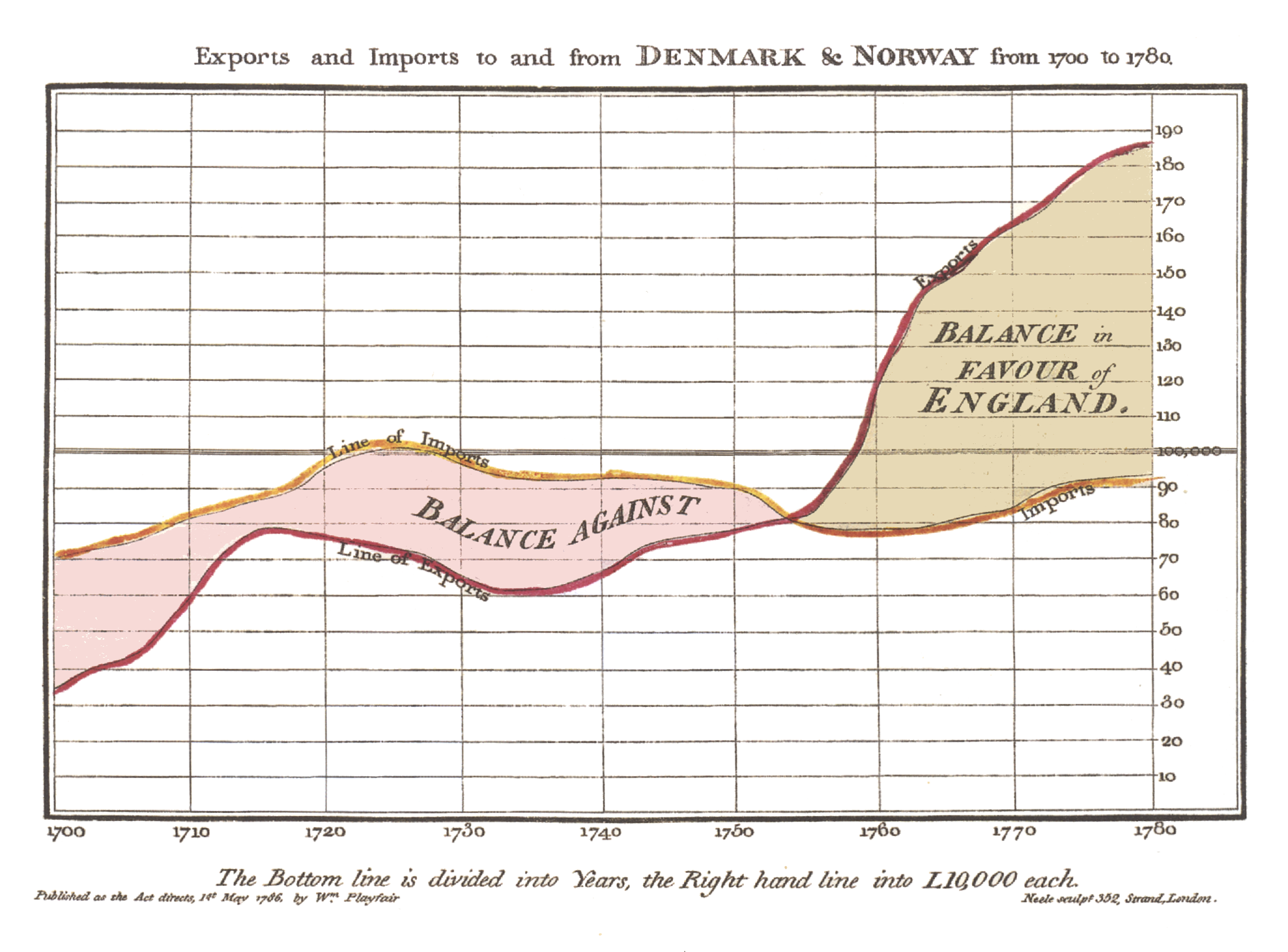
William Playfair, Balance of Trade Time Series, 1786
Aims and Scope
This half-semester course is an introduction to visualizing data. It is aimed at graduate students in the Sociology department. We will focus on the practical analysis and presentation of real data in a hands-on fashion. We will also read some material on principles of data visualization, in order to help develop a good working sense of why some graphs and figures work well while others either fail to inform or actively mislead. As much as possible I will want you to work with your own data, or at least real data that you are interested in.
Requirements
You are required to attend, participate actively, and do any assigned homework. We will be coding in class, working through cases, examples, and problems as we go. This means you must bring your laptop to class (with the needed software installed, after the first week) in order to participate properly. You should also have a dataset of your own to work with. I strongly encourage you to choose a dataset you are actually using in your own substantive research, and work with that throughout the course. If your data is extremely difficult to work with for some reason, or has strict confidentiality rules associated with it, try to find a related but more tractable dataset to use instead. (Ideally, one with the same basic structure.)
At the end of the seminar we will have a presentation day. You will be required to give a short talk to the class, presenting the results of an original analysis and visualization of your own dataset. The idea is to visually convey what is interesting about the data—either in terms of initial description, or finished analysis, depending on how long you have been working with the data—as directly and informatively as you can. To that end the presentations will be done in a PechaKucha style. You will have twenty slides to work with, each of which will be shown to the audience for twenty seconds, for a total presentation time of six minutes and forty seconds. Slides will advance automatically, ready or not. For both audience and presenter alike, this format tends to turn the feeling of waiting for the next slide from one of comatose boredom to slightly frantic excitement, much to everyone’s benefit.
No final paper is required for the course.
Software
I teach the course using R, the free software environment for statistical computing and graphics. R can be downloaded and installed Mac OS X or Windows computers, as well as Linux. Once you have R installed, you should consider installing R Studio, an integrated development environment that makes using R more straightforward. Rstudio is also free.
We will spend most of our time using ggplot2 and lattice, two R graphical libraries that you can use directly to draw figures, and which are also taken advantage of by many other packages to draw summary graphs or visualize the output of statistical models.
Strictly speaking, R is not required for the course. It might also be possible to use, e.g., Stata to do the assigned work and final presentation. However, I will not be able to offer you much in the way of technical support if you insist on using it. R is widely used across the social sciences and beyond, and there is a very large volume of code and other supporting material available within its very active user and developer community. While Stata and other commercial statistical packages have many virtues, and Stata in particular has a lively user community and powerful advantages of its own, it’s probably worth your while to learn at least some R, especially as its visualization capabilities are very good indeed.
I encourage the use of version control using Git. Git allows you to keep track of changes to your code, and much more besides. Git is also free and available for Windows, Mac, and Linux operating systems. Like R, Git also has a number of third-party third-party front ends that make it more convenient to use if you prefer not to work from the command line. Some of these are free, most are not terribly expensive. You should also sign up for a free account on GitHub, where much of the material for the course will be hosted. I have a request in to GitHub to allow students in the class to have free private code repositories, which we will use for homework assignments.
References and Resources
This list will be updated as we go.
Books
Here are some books you may find of use throughout the course. None is required to purchase, and readings will be provided as PDFs as needed. But they’re good. Note that many of these are available online (e.g. at Springer’s SpringerLink website) in their entirety.
- William S. Cleveland. 1993. Visualizing Data. Hobart Press.
- William S. Cleveland. 1994. The Elements of Graphing Data. Revised Edition. Hobart Press.
- Peter Dalgaard. 2008. Introductory Statistics with R. 2nd. Ed. Springer.
- Frank Harrell. 2001. Regression Modeling Strategies. Springer.
- Norman Matloff. 2011. The Art of R Programming. No Starch Press.
- Paul Murrell. 2006. R Graphics. Chapman & Hall/CRC.
- W.N. Venables and B.D. Ripley. 2002 Modern Applied Statistics with S. 4th Ed.
- Edward R. Tufte. 1983. The Visual Display of Quantitative Information. Graphics Press.
Websites related to R
- Try R. An interactive online tutorial. Worth signing up and completing.
- IDRE at UCLA. A very useful resource with numerous worked examples, including data visualization, across a range of statistics packages.
- Flowingdata. Nathan Yau’s website. Good for inspiration and also tutorials.
- RStudio Cheatsheets Well-designed cheatsheets for working with ggplot2, RMarkdown, RMarkdown again, dplyr and tidyr, and R Packages.
Websites related to Git
- Try Git. A hands-on introductory git tutorial in your browser.
- Set up Git. If you will be using Git mostly or entirely via GitHub, look at these how-tos. GitHub also has its own desktop application, if you want to stay away from the terminal window as much as possible.
- Pro Git. A complete, book-length guide and reference to Git, by Scott Chacon and Ben Straub.
Stack Sites
- Stack Overflow. Programming and developer Q&A site. Search as normal for keywords, add tags enclosed in square brackets, e.g.
[ggplot]or[git], to restrict results to the library or language you want answers in. - Cross Validated. A site in the same family as Stack Overflow, focused less on the specifics of code and more on conceptual and interpretive questions in statistics.
Outline
This is a new course. The material covered and the topics emphasized will depend in part on the needs of the students. This outline is provisional, and we will fill it out (and possibly change the topics and ordering) as we go.
Week 1: Getting Started
We will get up and running in R, set up your work environment so that you are writing code you can document and reproduce later, and discuss the basics of plotting clean data.
- Mechanics: Getting you up and running in R, and on GitHub.
- Why bother with graphs and figures?
- Some very general Principles of data visualization and statistical graphics.
- A simple worked example.
Week 1 Materials
Setup
- Set up Git.
- Jennifer Bryan, R basics, workspace and working directory, RStudio projects. This is an introduction to the basics of R and RStudio, if you are completely unfamiliar with either. (Jenny’s teaching materials on R are well worth looking at more closely.)
Optional Reading
Kieran Healy. 2011. Choosing Your Workflow Applications. The Political Methodologist 18 (2), 9–18.
Kieran Healy. 2014. Plain Text, Papers, Pandoc. An overview of how to get from a plain-text RMarkdown document to a nice PDF or HTML page. Something like this is what goes on behind the scenes when you generate reports or slides in RStudio.
Kieran Healy and James Moody. 2014. Data Visualization in Sociology. Annual Review of Sociology 40: 105-128.
Week 2: Getting into ggplot
- More on perception and the principles of graph construction it implies.
- Graphs are simple and immediately interpretable, just until you need them to be detailed and require study.
- Working with
ggplot: data, layers, and mappings.
Week 2 Materials
Week 3: Exploring Datastets
- More on
ggplot. - Examining some new data.
- 1-D summaries;
- Effective use of Categorical Variables, Facets, and Small-Multiples
Week 4: Presenting Results from Models
- Tidying model output with
broom. - Model estimates, error bars, confidence intervals, predicted probabilities.
- Showing data and models together.
- Comparing multiple estimates.
Week 5: Maps
- Maps and Map Projections
Week 6: Refining Plots for Presentation
- Building up plots, again.
- Annotation, themes, integration with page or slides.
- Helper functions
Week 7: Presentations
- PechaKucha time.